Grid Costs are Power Law Distributed
On an average day in ERCOT in 2024, $33.9M of electricity was purchased in the wholesale power market. That’s a bit shy of $1.5M per hour.
On the costliest day of 2024, August 20th, $469.5M was purchased. Of that, almost half of the costs came during one hour: $217.7M at 8pm.
Given that energy costs1 on the system were 6.4x higher than average on August 20th, you might expect that 6.4x more energy was consumed. And given that 46% of that day’s costs were during the 8pm hour, you might expect that 46% of energy was consumed in that hour.
But as it turned out, energy sales were only 1.3x average (1.69TWh vs. 1.27TWh) and only 4.63% (1.11/24) of energy sales were in the 8pm hour. The hour with the highest load and energy sales was actually 5pm, when system costs were only $4.6M. How can this be?
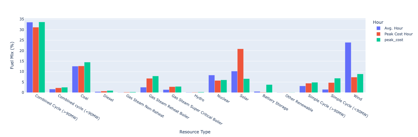
The peak load MWh is more expensive than the average MWh because the peak load MWh is produced by relatively high-cost generation technologies. When load is low, inexpensive baseload technologies - nuclear and coal - make up a lower percent of generation. As load rises, technologies with higher marginal costs of production are engaged to meet the load. At peak load, the fuel mix has a higher proportion of Gas-Steam Reheat Boilers, Gas-Steam Supercritical Boilers, and Simple Cycle units.
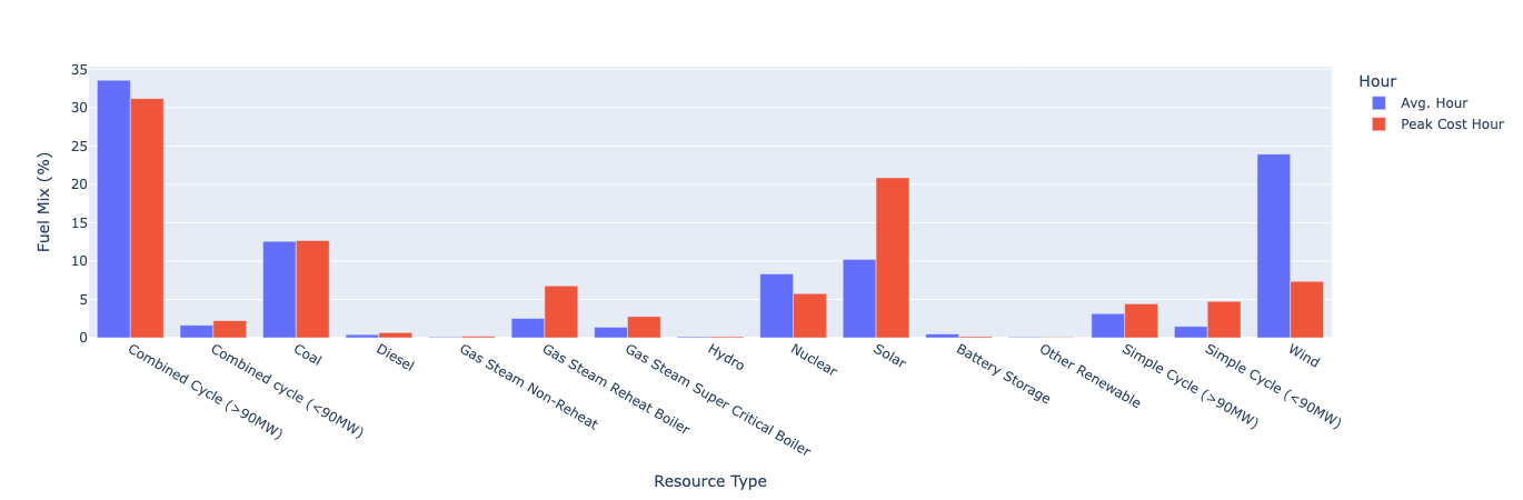
And the peak load hour isn’t the costliest hour because peak load typically occurs in hot, sunny daylight hours when low-cost solar resources are active. In the above graph you can see that solar and wind switch places with each other, with solar heavily represented in the peak hours and wind heavily represented in the average hour (because wind blows more than the sun shines, but it blows most at night). Since wind and solar both have very low marginal costs, the costliest hours occur when the output of those resources is low.

In ERCOT, load typically peaks at 5pm from afternoon heat as people begin to transition from commercial buildings to less efficient residential buildings. But the costliest hour tends to be 7pm because the sun has set, ending solar generation, but the nighttime wind hasn’t picked up yet. And lingering afternoon heat keeps cooling demand high as residences engage in evening activities.
During the costliest hour of 2024, 7pm on August 20th, renewable output was low, with the balance being made up by high marginal cost gas resources and also, especially, battery storage resources.
But the cost differences are too extreme to be entirely explained by marginal costs. The explanation lies in the fact that there are two regimes governing power prices. In typical conditions, energy prices are set by the marginal variable cost. In tight conditions, energy prices are set by the value of lost load. In principle, this is the value of the power to consumers. In practice, system operators place an administrative ceiling on wholesale energy prices2.
Whenever the implied system heat rate is greater than the heat rate of any running unit, the units are all earning profit that goes towards paying their fixed costs and earning an economic return. In these cases we say that the price incorporates some ‘scarcity value’, the value generators are providing by preventing unserved energy. In ERCOT, this value is accounted for with an explicit surcharge (the ORDC) based on a calculation, but it may also be reflected in unit bidding.
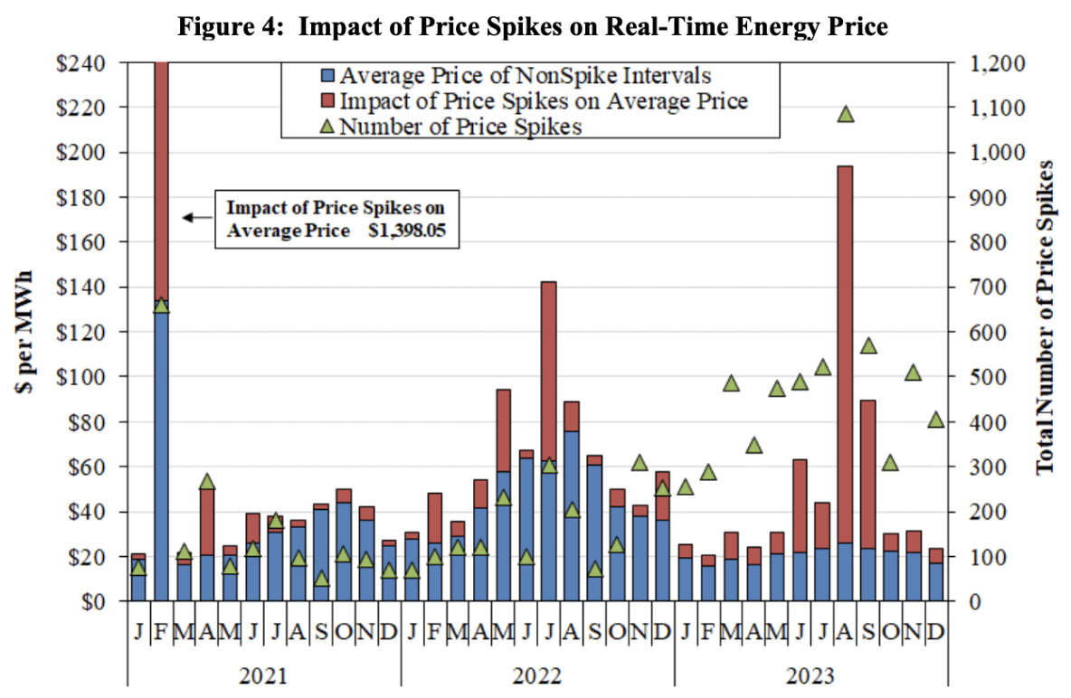
The above chart from the 2023 ERCOT State of the Market report shows average monthly power prices with the portion attributable to price spike intervals during the month3. It shows how the two components of average power prices behave independently over time. The spike-free average price, reflecting marginal production costs, is relatively stable. Its changes over time are driven by the cost of natural gas and how often gas resources are marginal versus renewables. The portion of average prices attributable to price spike intervals, reflecting scarcity value, is volatile. Average energy prices reflect a mix of fuel costs and the frequency of price spikes4.
How does this price behavior translate to system costs? The vast majority of hours have a relatively low system cost, and a few hours have an extremely high cost. Half of all system costs come from just 14% of hours.
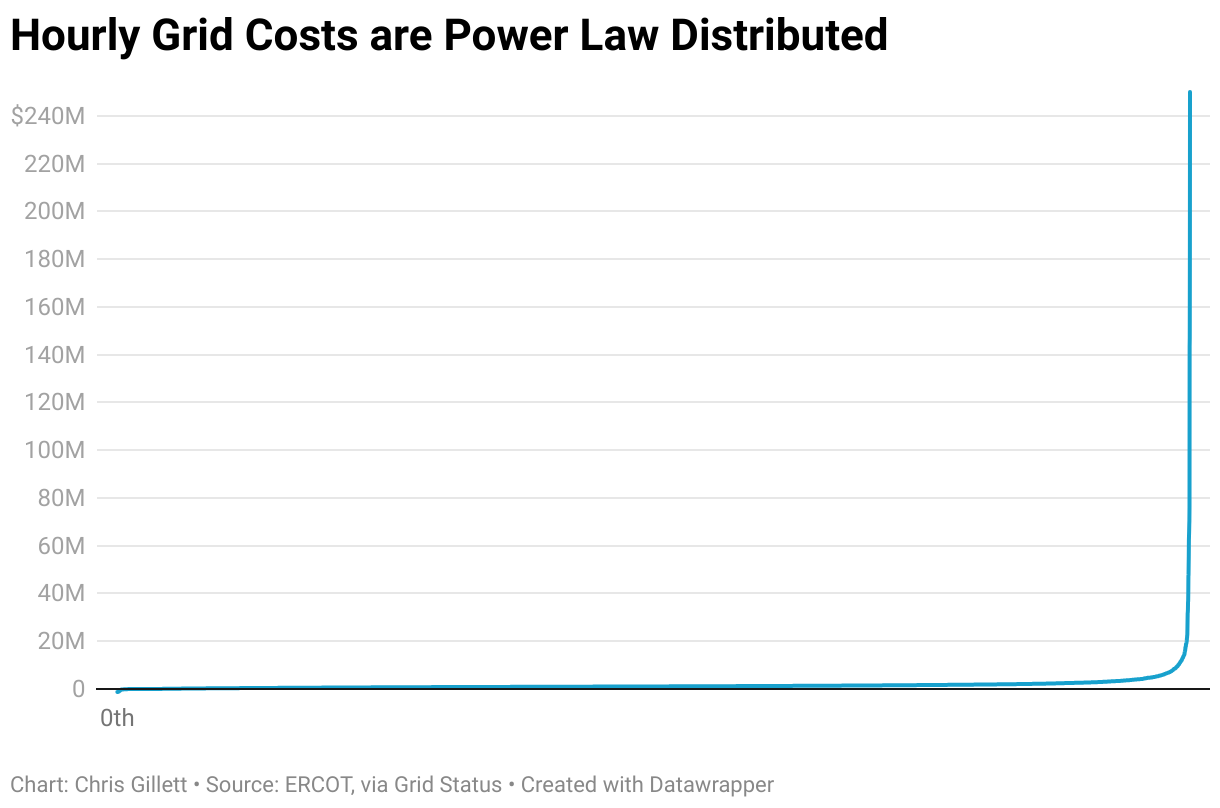

Squinting at the two graphs above, we can roughly see what percent of system energy costs are attributable to the marginal variable cost regime versus the scarcity price regime.
In the first chart showing hourly system costs from least to greatest, the “elbow of the bend” occurs at about the 50th most costly hour. Lets call those our “scarcity hours”. If we look at that 50th hour mark on the cumulative cost graph, we see that 84.6% of system costs come from the non-scarcity hours.
So why not set the price cap very low, so that generators never earn value beyond marginal production cost, to lower system costs? The problem with that is that many generators earn a significant portion of their revenue in those scarcity hours.

This curve shows every resource ordered based on what percent of their energy revenue5 came from scarcity hours. Of the 1,240 units in my data, 80 of them (6.5%) got more than half of their revenue from the 50 costliest hours in 2024. That’s nuts. 6.5% seems small, but you’d miss them if they were gone. Now let’s look at that on a resource type basis.
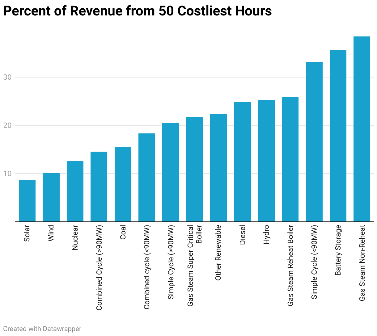
Unsurprisingly, the resource types that collectively get the most of their revenue from the 50 costliest hours (lets call this percent the ‘scarcity concentration’) are the same resource types that were overrepresented in the costliest hour versus the average hour in the first first graph at the start.
Nuclear has 12.81% scarcity concentration, which is roughly in line with the 15.4% of total system costs we see come from those hours. That’s not a coincidence. Nuclear resources run almost all the time, so the concentration of their revenue in those 50 hours should be similar to the whole system’s concentration of costs in those hours. That makes nuclear a good benchmark for comparing the revenue concentration of other resource types.
The only way you could have less scarcity concentration than nuclear is if you’re not running all the time and you’re somehow systematically missing the highest cost hours. No generator would intentionally avoid the high cost hours, so these resource types must not be able to control when they dispatch. And indeed the two resource types with less revenue concentration than nuclear are the non-dispatchable renewables, solar and wind.
A resource with more scarcity concentration than nuclear runs less than nuclear does but its running hours are more concentrated on the scarcity hours. Most resources are in this category, and there seems to be a smooth gradient of increasing scarcity concentration until we reach units that abruptly show much higher revenue concentrations.
This first group are intermediate or load-following units that fill the gap between load and baseload plus renewable generation. The second group are peaking units that run to fill load peaks when intermediate units are fully dispatched.
Since all of these units are equally dispatchable they probably all are running during almost all of the scarcity hours6. So the differences in their scarcity concentration stem from differences in their overall capacity factor. The capacity factor is the percent of maximum capacity that a unit dispatches over a period of time7. Units with a higher capacity factor have less scarcity concentration because they run and earn revenue over more non-scarcity hours than units with lower capacity factors. And looking at the graphs below, that’s what we see.

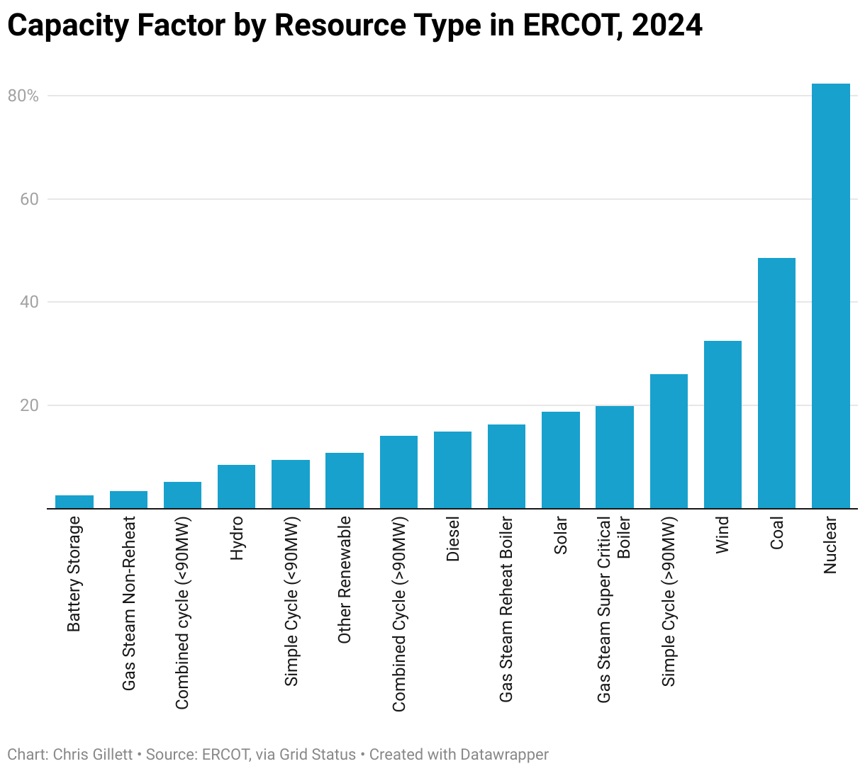
Again there’s a smooth gradient of decreasing capacity factors, then a somewhat abrupt decrease. Units with lower marginal production costs run more often, since lower marginal cost units are dispatched before higher cost ones. The smooth gradient in decreasing capacity factors reflects a smooth gradient in increasing marginal costs.
This scatterplot compares the capacity factor and scarcity concentration of every unit, colored by its revenue earned per MW of capacity. The dots seem to form a curve that slopes higher as capacity factor gets slower. You can think of this as the upper end of a trade-off. Units with high capacity factors earn the most revenue per MW because they generate more power. As your capacity factor decreases - because your marginal production cost increases and you become less competitive - your production had better be concentrated more efficiently into high-price hours (higher scarcity concentration). If two units have the same capacity factor, the one with the higher scarcity concentration tends to earn more revenue.
When looking by resource type, we see that non-dispatchable renewables make up the bulk of units below the efficient tradeoff curve. The exceptions are battery storage resources, which have low capacity factors because they earn lots of revenue in ancillary services, and various units with availability issues clustered near the origin.
This scatterplot shows this another way. There’s a roughly linear relationship between capacity factor and revenue per MW. Again, non-dispatchable renewables are an exception. In this graph it’s clearer that the low-capacity factor units with high scarcity concentration have higher revenue.
Including this graph so you don’t have to take my word for it that renewables are the exception. No surprises here at this point.
And finally, because I’ll get emails if I don’t include this, here’s a 3D scatter plot:
It might not be clear why there’s this much differentiation between resource types on the grid. It’s a reflection of engineering tradeoffs in the design of power plants. Thermal plants designed for larger capacities have lower variable production costs because of thermodynamic, steam cycle, and other efficiencies.
But this comes with several drawbacks. Large units can’t operate as flexibly as smaller units; they need more downtime between runs, they have higher minimum stable load factors8, and they can’t ramp their output up or down as quickly. They’re big, lumbering beasts. And they have high capital costs. Between their low production costs, low operational flexibility, and high capital costs, they have to run at high capacity factors.
-
Note that I’m talking about energy costs, not overall system costs. If we included all system costs, they would be distributed even more extremely towards a very few hours out of the year. For example, the transmission system is designed with the highest load hour in mind. Many costly grid upgrades are only necessary for a few hours of the year. ↩
-
The economic reason for doing this is that end-consumers have low demand elasticity because they’re rarely exposed to real-time prices. ↩
-
They defined price spikes as prices reflecting an implied system heat rate above some threshold. ↩
-
It also reflects the price cap. ↩
-
I’m only looking at energy revenue here, not revenue from Ancillary Services, Reliability Must Run agreements, or anything else. Also, for battery storage resources (BESS), I’m only looking at what they make from exporting electricity, not what they’re charged when they import electricity. Also, BESS gets a substantial portion of their revenue from Ancillary Services (a higher portion than any other resource type), which isn’t included in this analysis. ↩
-
It’s generally known a day ahead of time when scarcity hours will occur. The only reason to miss running during these hours would be if the unit had an outage. ↩
-
For example, if a unit has a 100MW capacity and outputs 25MW for 5 hours and 75MW for 5 hours, its capacity factor is (25MW * 5hrs) + (75MW * 5hrs) / (100MW * 10hrs). This is not to be confused with the utilization rate which looks at hours the unit was running, regardless of how much it output, or the availability rate which looks at hours the unit was available to run, regardless of whether or not it did run. ↩
-
The minimum stable load factor is the minimum percent of the plant’s nameplate capacity at which the plant can run sustainably. Think of how a bicycle and a plane have a minimum speed at which they’re stable. ↩